Improving usability and reducing friction for environmental sampling workflows through user-centered design research

Aspects of this project are confidential & can’t be displayed publicly. If you’d like to know more about my process, schedule a portfolio presentation.

When we joined Sampleserve, we faced a unique challenge: the CEO didn't know what his users were struggling with. This isn't unusual in B2B software—users often adapt to broken systems rather than complain, assuming "that's just how it works." We needed research methods that would uncover both the obvious and the hidden problems.
Additionally, Sampleserve had never worked with designers before. We couldn't just dive into user interviews—we needed to quickly build credibility with stakeholders while simultaneously understanding the system. This required a strategic layering of research methods, starting with what we could do independently and building toward direct user engagement.
Users weren't confident their inputs were saved due to missing confirmation messages. This created anxiety and led to repeated actions, decreased productivity, and loss of trust in the system.
User Quote:
"I never know if my data actually saved or not. I usually click save multiple times just to be sure."
The platform had two inconsistent interfaces (third-party vs in-house), rigid CSV formatting with poor error messaging, and no way to fix upload errors—resulting in frequent IT intervention.
Users had to learn two different interaction patterns
CSV uploads failed with cryptic error messages
No ability to correct errors inline, requiring complete re-upload
Heavy reliance on backend team for troubleshooting
We implemented clear confirmation messages and real-time feedback throughout the application. Users now receive immediate visual feedback when actions are completed, including success messages, loading states, and progress indicators.
Added:

Success toast notifications

Auto-save indicators

Loading states for async actions

Clear success/error messaging
Impact:
Increased user confidence
Reduced duplicate submissions
Fewer support tickets
We created a consistent design system and unified the upload interface, making it more flexible and user-friendly with better error handling and recovery options.
Added:

Consistent style guide across all interfaces

Unified upload interface

Editable fields for quick corrections

Flexible CSV parsing

Clear error states with recovery options
Impact:
Single, learnable interface
Self-service error correction
Reduced IT intervention
Faster data upload workflows
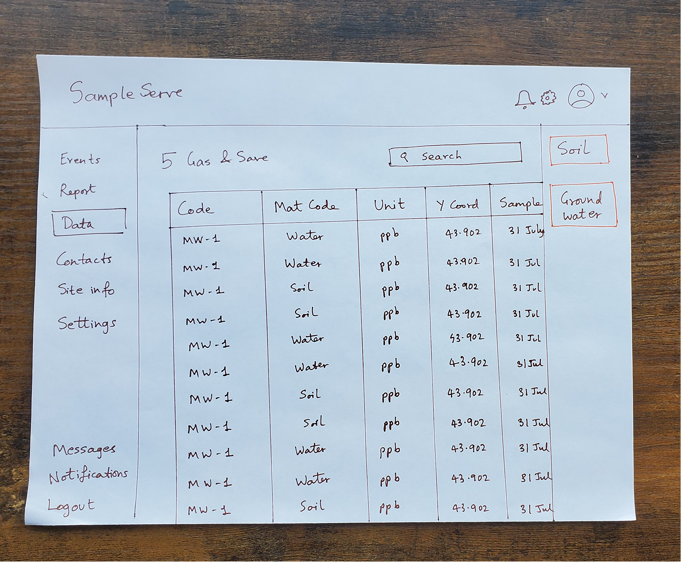
Adding one sidebar (with the view change option) to the right instead of having both on the left, still took a lot of real estate and puts less focus on the table.
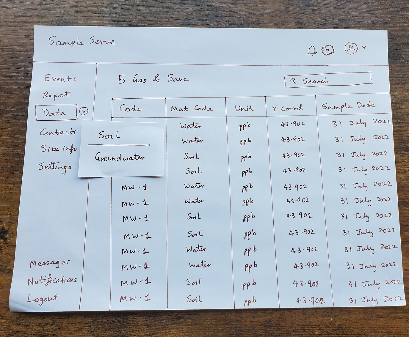
Adding the view change option to a drop down on the left side bar, was not easily discoverable for all users.
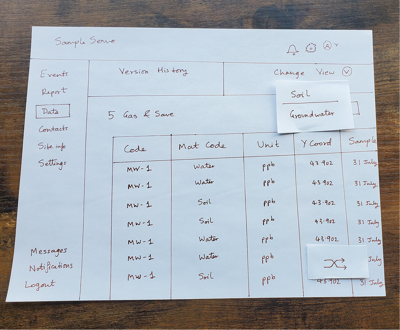
Top bar with tabs for history + view change option - not preferred position for version history option. Also had a floating action button to change view at the bottom, was not evident what it did right away.
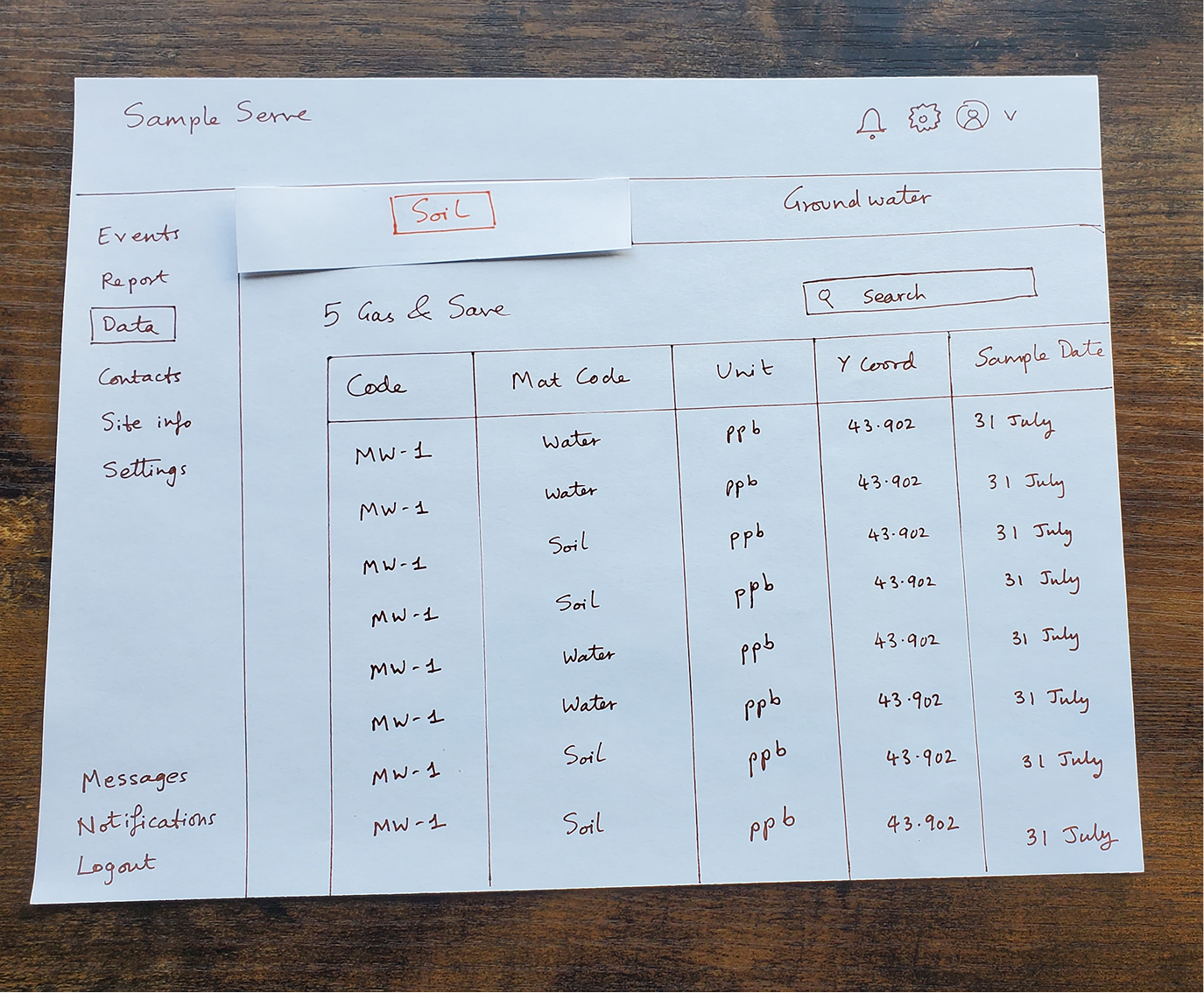
Adding view change in tabs on the top, was intuitive, worked the best of all options.
Rife with accessibility issues, usability issues, no consistency in style guide and no visual hierarchy to prioritize what is important to the user.
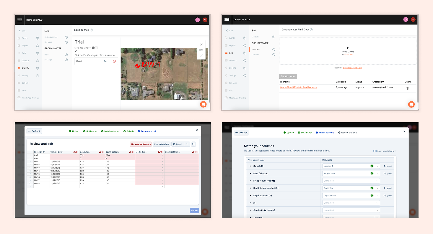
UI is accessible, has consistent style guide, and real estate is utilized properly to focus on what is important to the user.


Increased user trust and confidence in their actions

Significantly reduced reliance on backend intervention and IT support

Addressed real user pain points from recent software changes

All design changes were adopted and shipped into production
Dave, a happy field technician
The CEO was surprised by the problems we uncovered, his customers had never explicitly mentioned these issues. This reinforces the importance of proactive user research and observation over relying solely on customer feedback.
By combining multiple research methods—usability testing, interviews, heuristic analysis, journey mapping, and more—we were able to identify problems that wouldn't have surfaced through any single method alone.
Unifying the interface and creating a consistent design system significantly reduced user confusion and the learning curve, making the platform more accessible and efficient.
Giving users the ability to self-serve and correct errors inline dramatically reduced the need for IT intervention, creating a better experience for everyone involved.